Tableau Public - Data Visualization - Game of Thrones
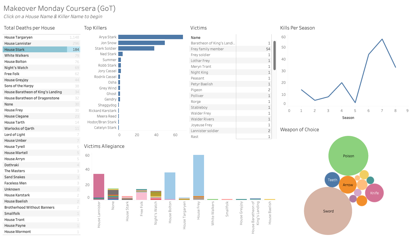
This dashboard presents a detailed analysis of deaths in the “Game of Thrones” series, complete with visual representations and statistics. Who is the deadliest character or House and who has fallen victim to them? What is their weapon of choice? Get ready to relive some of the most iconic moments and discover new insights into the grim reality of life in Westeros. Link to dashboard
This dashboard was completed for my Fundamentals of Visualization with Tableau course project in Coursera. Data is from #MakoverMonday